A keyboard-first calendar picker in React
My final-year degree project: an accessible React and TypeScript date picker, built on the W3C pattern with its own date maths and focus handling, then tested with a screen reader.
- tech stack
- context
- Final-year degree project, 2023
- degree
- BSc Digital and Technology Solutions, University of Wolverhampton
- mark
- 75/100, a first
I studied for my degree as an apprentice, alongside full-time work, and this was my final-year project. The code is in a private repository, so this is a walk through what I built, what testing turned up and what I’d change now.
The problem
A date picker without proper keyboard support or labels shuts out anyone using a keyboard or a screen reader. My project asked whether an accessible picker, meeting WCAG 2.1 AA, could be built in React at a sensible cost, and what it would take.
The obvious candidate was <input type="date">. I ruled it out because its calendar looks and behaves differently from browser to browser, many of those versions don’t follow the W3C’s guidance for an accessible picker, and it leaves little room to match a design system. Few of the picker libraries I looked at met accessibility standards either. I could have built my own on top of helper libraries for dates and focus trapping, but I chose to build it without them, to find out which ones I really needed.
My approach
I based the picker on the date picker dialog in the W3C’s ARIA Authoring Practices Guide, and compared it with the accessible picker from 4X, which follows the same guidance. I wrote the components as React classes. In 2023 that was still the norm where I worked; we hadn’t yet moved to function components or newer versions of React.
A real table
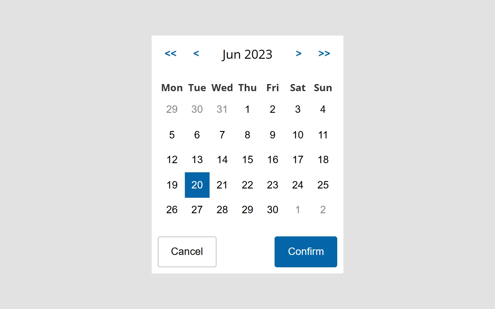
The calendar is a <table>, so a screen reader can announce where you are in it. The weekday headers show short names, with the full name as their accessible label. The first day of the week is a prop that defaults to Monday, and the grid fills its first and last rows with greyed-out days from the neighbouring months. Choosing one moves the calendar to that month.
The month and year above the grid are formatted with Intl.DateTimeFormat, so they follow the reader’s locale, and sit in a polite live region, so a screen reader announces the new month when it changes.
Keyboard and focus
Inside the grid, the arrow keys move by a day or a week. Home and End jump to the first and last day of the week, which gets fiddly once the week can start on any day. Page Up and Page Down move to the same day in the previous or next month, and with Shift held they move a year, as in the W3C pattern. They use the month helper described below, so Page Down from 31 March lands on 30 April instead of spilling into May. Space selects a date and keeps the calendar open, Enter selects and closes, and Escape closes without changing anything. Only the selected day is in the tab order (the roving tabindex pattern), so Tab moves between the grid and the buttons around it while the arrows move within it.
<button tabIndex={isActive ? 0 : -1} onClick={onClick}>
    {day}
</button>
When the date changes from the keyboard, focus follows the new day. When it changes from the previous and next month buttons, focus stays on the button you pressed, so pressing it again moves on another month. After you pick a date, focus goes to the text field rather than the calendar button, so you can check the date or correct it straight away.
I looked at <dialog> for the popup. Its show() method doesn’t keep focus inside or close on Escape, and showModal() brought a backdrop, modal semantics and blocked clicks outside, none of which I wanted. So I wrote a focus trap: it keeps Tab inside the calendar, closes on a click outside, and can hand focus back to whatever had it before.
The typed input
Typing is often the quickest way to enter a date you already know, so the picker has a text field too. Date formats differ by locale (day first, month first, slashes or dashes), and parsing all of them well needs a library, so I kept to dd/mm/yyyy and said so on screen, with extra text for screen readers explaining that it’s the format. An invalid date gives the field a red border and a short shake, so the error doesn’t rely on colour alone, and the message is announced through a live region.
Date maths without a library
I wrote small helpers for adding and subtracting time, building the weeks of a month and comparing days. I modelled their API on date-fns, so a library could replace them without rewriting the components. Months are the interesting part, because JavaScript’s Date rolls over: ask for the month after 31 January and you get early March. The helper clamps the day to the length of the target month instead:
const addMonths = (date: Date, amount: number): Date => {
    const result = new Date(date);
    const day = result.getDate();
    result.setDate(1);
    result.setMonth(result.getMonth() + amount);
    result.setDate(Math.min(day, daysInMonth(result)));
    return result;
};
Testing
I tested against a written plan covering keyboard use, the NVDA screen reader, colour contrast, colour-blindness filters, text resizing and translated text. Once the code had settled I added 141 unit tests with Jest, covering every statement in the component.
A designer also reviewed it. Their feedback was positive: they felt the picker showed a good grasp of what people needed from it and of the accessibility problems it had to fix. They raised two accessibility points: the day cells were packed so tightly that picking a date took precision, and there was no quick way to clear the date. On the visual side, they suggested icons in place of the text arrows, the standard focus and hover styles on the dates, a small change to the shadow, plain rather than bold weekday names, and no italics on the format hint.
Challenges
The screen reader found a problem my research hadn’t. In NVDA the arrow keys did nothing in the grid, because NVDA stayed in browse mode and kept the keys for itself. It doesn’t switch to focus mode for a button inside a table cell, and that turned out to be an issue already reported against the W3C’s own example.
The month rollover caught me a second time when choosing a greyed-out day from a neighbouring month. Setting the month and then the day could overflow in between, and the date landed in the wrong month. My first fix set the day before the month. The fix that lasted sets both in one call, setMonth(month, day), so there’s never an in-between date to overflow.
Focus had its own bugs. A day button could try to focus itself before its ref was attached, and focus sometimes failed to land when the new date was in a different row. Each fix came back to the same question: which element should have focus after this change, and does it exist yet?
lesson learnt
Test with the assistive technology, not just against the guidance
I followed the W3C pattern closely and it still failed in NVDA. Knowing how screen readers switch modes could have changed how I built the grid, so I’d learn the tools before designing for them.
What I’d do differently
I concluded that an accessible picker was feasible, and that the version I’d built was a good base. These are the gaps I’d close first:
- Use a date library. I was never confident my helpers were safe across time zones, which I didn’t have time to test properly. I’d pick Luxon over date-fns, because it builds on
Intl, which the picker already leaned on, and parsing would let the text field accept the format each person is used to. - Act on the designer’s review: day cells of at least 44 pixels, a quick way to clear the date, and icons in place of the
<<,<,>and>>text, each with an accessible name such as “Next month”. - Finish what I ran out of time for, such as a live region announcing the keyboard shortcuts.
- Test on more devices and browsers and with more assistive technology. My focus trap could be temperamental depending on what it wrapped, and wider testing is how I’d pin that down.